GRANT'S BRAES SCHOOL
Rethinking the approach on digital platforms for schools

 CASE STUDIES
Alongside the University of Otago, we developed a series of online learning modules. They deliver information and training to SME tourism operators nationwide. In line with the Tourism Industry Aotearoa (TIA)’s sustainability commitments; to deliver world-leading tourists experiences, Culture Ready supports tourism operators to achieve the common goal of developing well-managed, sustainable visitor destinations.


Here’s how we brought the learning tools to life. Following Design Thinking Methodologies, using qualitative research, UX and UI design.
Tourism helps to support local jobs by adding diversity, vibrancy and prosperity to communities. While the New Zealand tourism industry continues to adapt to the challenges of COVID-19, there is a great need to support this sector. Culture Ready supports businesses to create resilient, inclusive and sustainable destinations across Aotearoa. It helps tourism operators to be well informed and to generate a better experience for their visitors. Culture Ready provides expert knowledge from business professionals, cultural experts and visitors alike.
We have produced a custom-built website, using modern Umbraco Content Management Software. It contains a series of interactive learning modules, quizzes, and video features. Due to the variety of information shared, it was essential to consider user-based decisions from all angles. Our design studio worked closely with stakeholders to gather qualitative data and user research. Our mission was to uncover the learning processes and behaviours of users within the Tourism industry. Sequentially, we have developed the platform with three main objectives: Excellent User Experience (UX), accessibility, and affordance.
The Hustle is proud to have produced a polished and user-friendly website for tourism operators to use nationwide. Culture Ready is an information packed, easy to use knowledge platform that makes understanding cultural differences simple. While our team has focussed on strategy, design and development – The Culture Ready platform itself will bring vast improvements to New Zealand’s tourism experiences.
University of Otago - Department of Tourism
Culture Ready - Digital Platform
UX & UI Design for learning platform
2020
Dunedin, Otago
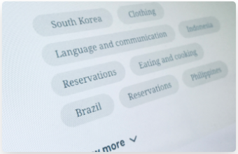
A solid content structure, with intuitive entry points, defines the platform’s possible uses and makes clear how it can or should be used.
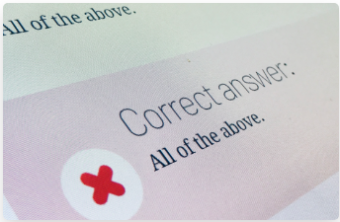
Instant and assertive feedback makes the learning process successful and digestible, and ensures a better knowledge acquisition.
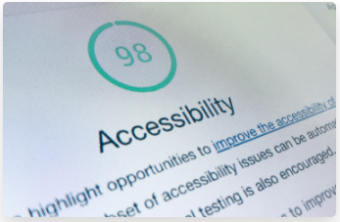
Within The Hustle team we follow human-centric guidelines. We are deeply committed with helping literally everyone, to enjoy every website’s content.
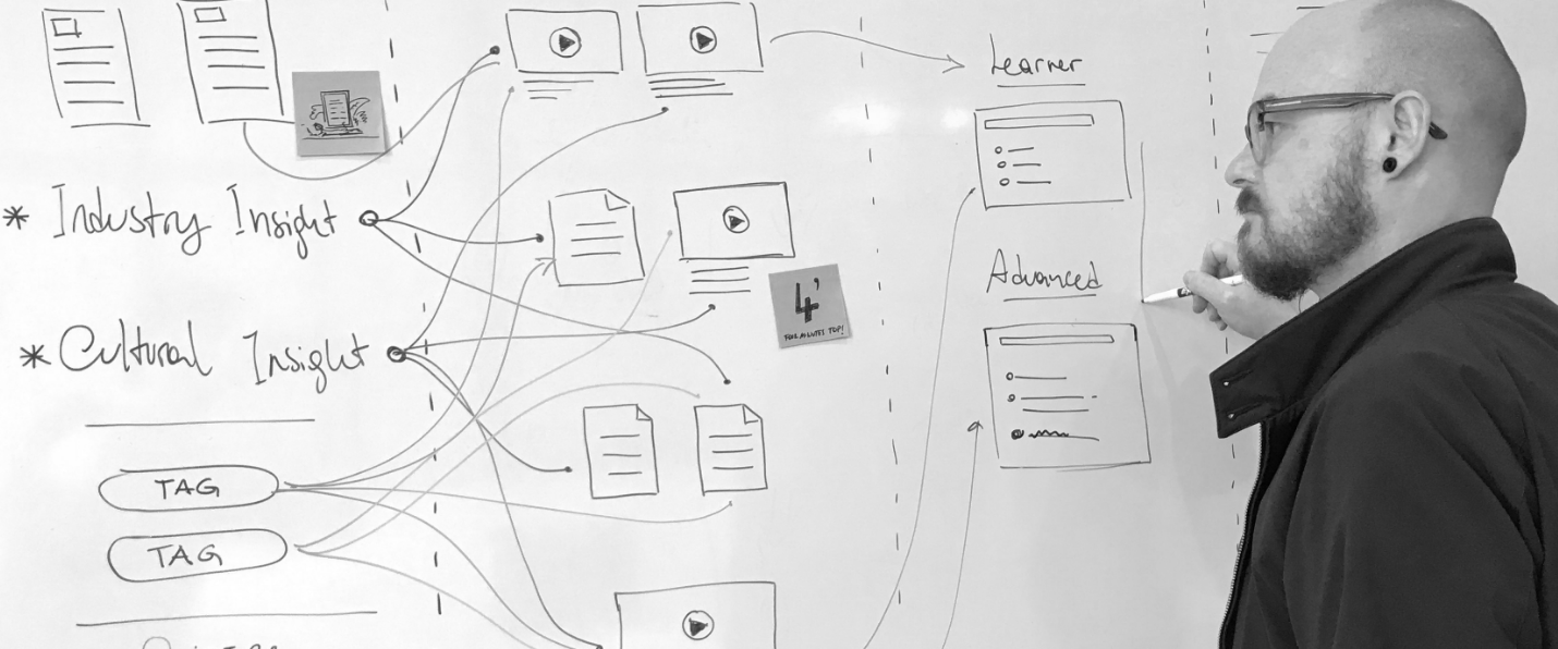
Following Design Thinking Methodologies, we started by seeking to understand people’s real needs and concerns. Our mission was to explore the process behind tourism service providers learning behaviours. The purpose of this research was to identify the most effective way to present information to our users. Our tool would be designed to support how people think and explore content, such as reading material and interactive modules.
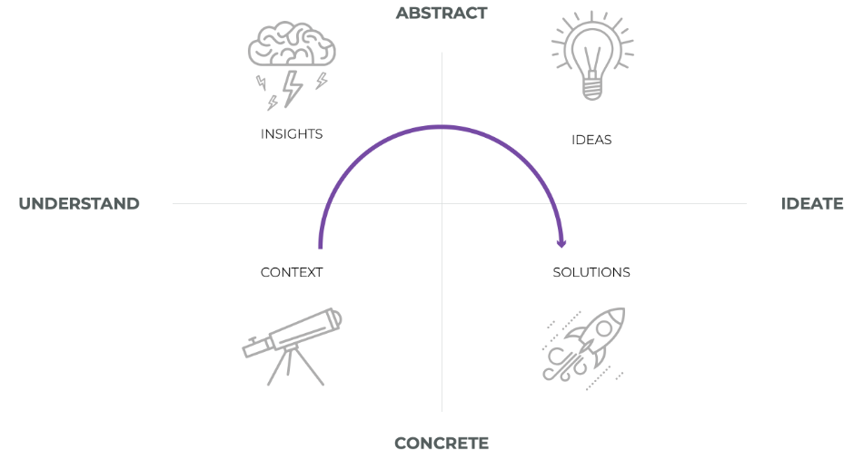
We worked closely with various stakeholders to exchange knowledge and scope in the initial research phase. We followed a theoretical framework to uncover our hypothesis. Qualitative research consists in collecting and analysing non-numerical data to understand concepts, opinions, or experiences. Throughout this phase we gathered insights, pain-points, bliss points, tools and workarounds to better understand our user’s behaviours.

“I think the tags are really useful because I can go through and select, whatever topic with under those topics in each video. And then I can either keep going or watch this other one”.

“I learn better by seeing and hearing (videos) as opposed to a podcast. I think I get full attention on that. I like looking at photographs and taking things in. So I’m a visual learner, an everything’s really simple in there and it makes sense”.

“Three to four minutes is really good to get a point across; if it takes longer than that to learn something of one thing, I think you’ll lose interest”.
"If I go back to my experience, the best way is to break the content down into different chunks, so I can choose to watch the chunk that I want”.
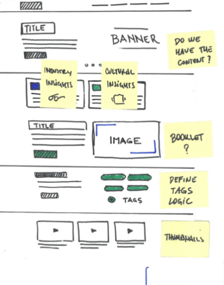
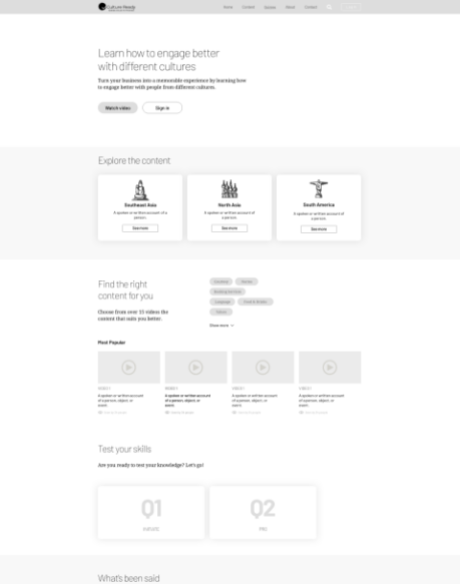
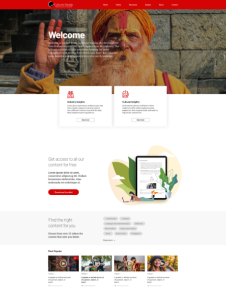
During the ideation and conceptualisation phase, we worked on the information architecture to navigate the content. The solution was fundamentally organising information on the site by enabling content to be linked by ‘Tags’. This allowed users to easily identify content throughout the website. We then established a sitemap and started on the first wireframes and prototypes.
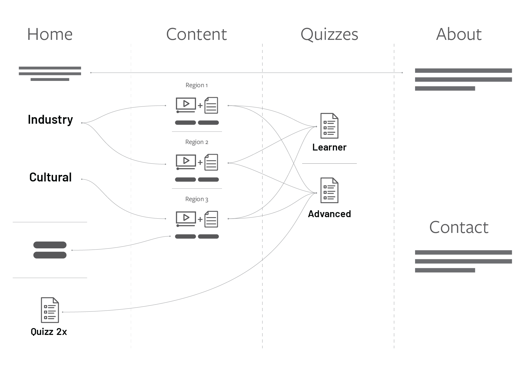
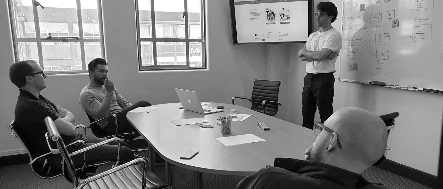
After delineating the desired user journeys and with the right content structure, we would be able to start sketching the User Interface (UI). Step by step we iterated incrementally from the wireframes, to a low-fi prototype to finally arrive at a polished, organised and intuitive UI.

Rethinking the approach on digital platforms for schools

Helping Gore District to become a top place to live in New Zealand

How we improved organic enquiries by over 80%
